 我的书签
我的书签
 添加书签
添加书签 移除书签
移除书签7.3 专题区
页面的专题区主要用于展示最新博客文章的前几段文字,同时右侧还有一小块区域,显示登录表单和最近博文的一组链接。以下就是section#feature_area元素的HTML标记。
- <section id="feature_area">
- <article id="blog_leadoff">
- <div class="inner">
- <h4>September 7, 2012</h4>
- <a href="#"><h3>Managing CSS Classes with jQuery</h3></a>
- <img src="images/charles_wyke-smith.jpg" alt="Charles Wyke-Smith photo" />
- <p>Sintus at neque in magna...</p>
- </div>
- </article>
- <aside>
- <form autocomplete="off" class="signin"
- action="process_form.php" method="post"> <!-- 必要的<form>标签 -->
- <fieldset> <!-- 作为表单控件的容器 -->
- <legend><span>Sign In for Code and Updates</span></legend> <!-- 控件组的标题 -->
- <section> <!-- 用于为控件、标注和说明添加样式的外包装 -->
- <label for="email">Email</label> <!-- 与控件ID同名的for属性将标注与控件关联起来 -->
- <input type="text" id="email" name="email" /> <!-- type属性的text值表明这是文本框 -->
- </section>
- <section>
- <label for="password">Password</label>
- <input type="password" id="password" name="password"
- maxlength="20" /> <!-- 密码框中的字符显示为掩码 -->
- <p class="direction">Wrong user name or password</p>
- </section>
- <section> <!-- 提交按钮 -->
- <input type="submit" value="Sign In" />
- <p class="signup">Not signed up? <a href="#">Register now!</a></p>
- </section>
- </fieldset>
- </form>
- <nav>
- <h3>Recent Articles</h3>
- <!-- 博文链接 -->
- </nav>
- </aside>
- </section>
这个section元素与容器同宽,我们要把它包含的article和aside元素浮动为并列显示。
- section#feature_area {
- overflow:hidden; /*包围浮动的子元素*/
- margin:16px 0 0; /*在页眉与专题区之间留出间隙*/
- padding:0 0 10px;
- }
- section#feature_area article {float:left; width:66%;}
- section#feature_area aside {float:right; width:34%;}
这样就在容器里创建了两栏。注意,两栏的宽度是用百分比值设定的,这是因为这个页面还要考虑适应不同的设备,包括平板电脑和智能手机。具体内容将在下一章讲解。为此,两栏就用容器宽度的百分比来设定了。
此时,应该在article元素内部添加一个内部div(前面HTML标记中加粗了),以便围绕内容设定圆角边框。之后,就是article区域的样式。
- section#feature_area article .inner {/*带圆角和阴影的容器*/
- padding:12px;
- background:#fff;
- border-radius:20px 0;
- box-shadow:0 12px 8px -9px #555;
- }
- section#feature_area article a {text-decoration:none;}/*博文标题链接*/
- section#feature_area article img { /*照片*/
- float:left;
- padding:0 10px 10px 0;
- }
- section#feature_area article h4 { /*日期*/
- font-family:"Source Sans Pro", helvetica, sans-serif;
- font-style:normal;
- font-weight:400;
- font-size:1em;
- color:#f58c21;
- letter-spacing:-.025em;
- }
- section#feature_area article h3 { /*博文标题*/
- font-family:Lato, helvetica, sans-serif;
- font-style:normal;
- font-weight:700;
- font-size:1.75em;
- color:#555;
- margin:0px 0 12px 0px;
- letter-spacing:-.05em;
- }
- section#feature_area article#blog_leadoff p { /*博文内容*/
- font-family:"Source Sans Pro", helvetica, sans-serif;
- font-style: normal;
- font-weight:400;
- font-size:1.1em;
- line-height:1.5em;
- color:#616161;
- margin:0 0px;
- text-align:justify;
- }
- section#feature_area article#blog_leadoff p::first-letter { /*首字母下沉*/
- font-family:Lato, helvetica, sans-serif;
- font-style: normal;
- font-weight:700;
- font-size:4.5em;
- float:left;
- margin:.05em .05em 0 0;
- line-height:0.6;
- text-shadow:1px 3px 3px #ccc; /*IE10及以上版本支持文本阴影*/
- }
- section#feature_area article#blog_leadoff p::first-line { /*首行小型大写字母*/
- font-variant:small-caps;
- font-size:1.2em;
- }
- section#feature_area aside { /*右栏*/
- width:34%;
- float:right;
- }
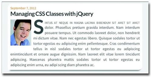
图7-10 section#feature_area中的aticle元素在设定了样式之后的效果
这些样式涵盖了本书前几章介绍一些元素。值得一提的是包含h3的a元素。要是在以前,行内元素包含块级元素可是大忌。但从HTML5开始,a元素可以包含任何元素,这当然为把任何元素转换成可以点击的链接提供了方便。
如图7-10所示,照片浮动到左侧,所以文本绕排。然后我们采用第4章讨论的首字母下沉和首行大型小写样式,为版式添加了一点趣味性,也让字形过渡更加自然。另外,我们还给放大的第一个字母添加了文本阴影,让它看起来像是悬浮在页面上。好了,下面该讲为表单添加样式了。
文本阴影
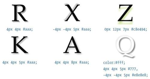
文本阴影与本章前头讲过的盒阴影很相似,它的语法如下:
text-shadow:4px 4px 5px #aaa;
text-shadow这几值的含义按顺序分别是:水平偏移量、垂直偏移量、模糊量和颜色。与盒阴影不同的是,文本阴影没有扩展量。最低限度,你得提供水平偏移量、垂直偏移量和颜色值。如果水平和垂直偏移量是负值,阴影就会出现在文本左上方。另外,text-shadow还支持多个阴影声明。图7-11展示了一些阴影示例。要了解文本阴影更高级的应用技巧,请大家参考我的电子书Visual Stylin' with CSS3。
图7-11 使用正、负偏移量,实现了各种不同的阴影效果
7.3.1 登录表单
我要求读者必须注册才能下载本书示例代码,以便提供更新并与大家保持联系。在这个主页上,提供了一个登录表单和一个指向注册表单的链接,注册表单是为第一次访问网站的读者准备的。登录表单的标记与第6章介绍的表单采用相同的结构方式,以下是其HTML。
- <form autocomplete="off" class="signin"
- action="process_form.php" method="post"> <!-- 必要的<form>标签 -->
- <fieldset>
- <legend><span>Sign In for Code and Updates</span></legend> <!-- 控件组的标题 -->
- <section> <!-- 电子邮件 -->
- <label for="email">Email</label> <!-- 与控件ID同名的for属性将标注与控件关联起来 -->
- <input type="text" id="email" name="email" /> <!-- type属性的text值表明这是文本框 -->
- </section> <!-- 密码 -->
- <section>
- <label for="password">Password</label>
- <input type="password" id="password" name="password"
- maxlength="20" />
- <p class="direction">Wrong user name or password</p> <!-- 只有添加error类才会显示 -->
- </section>
- <section> <!-- 提交按钮 -->
- <input type="submit" value="Sign In" />
- <p class="signup">Not signed up? <a href="#">Register now!</a></p>
- </section>
- </fieldset>
- </form>
下面是我从第6章表单的CSS中拿来的规则,并针对这个表单修改后的代码。
form.signin {width:19em; /*表单的整体宽度*/float:right;background:#fff;border-radius:10px 0 10px 0;box-shadow: 0 12px 8px -9px #555;}.signin fieldset { border:0; margin:10px 14px;}/*去掉默认的边框*/.signin legend span {font-family:Lato, helvetica, sans-serif;font-weight:700; font-size:1.3em; line-height:1.1em;color:#4eb8ea;letter-spacing:-.05em;}.signin section {overflow:hidden; /*包围控件和标注*/padding:.25em 0; /*表单元素的间距*/}.signin section label {font-family:"Source Sans Pro", helvetica, sans-serif;font-weight:400;float:left;width:5em; /*标注栏的宽度*/margin:.5em .3em 0 0; /*外边距保持文本与控件的间距*/line-height:1.1;color:#555;}.signin section input {float:right;width:10.5em; /*控件栏的宽度*/margin:.2em 0 0 .5em;padding:3px 10px 2px; /*输入文本与控件的间距*/color:#555;font-size:.8em;outline:none; /*去掉默认的轮廓线*/border-radius:10px 0 10px 0;}input:-webkit-autofill { color:#fff !important; } /*去掉WebKit默认的黄色背景*/.signin section input[type=submit] {float:right; /*将按钮与控件右边对齐*/width:auto; /*重设按钮宽度*/margin:0 2px 3px 0;padding:0px 8px 3px;font-size:1em;font-weight:800;color:#fff;border:none;background-color:#d6e636;box-shadow:1px 1px 2px #888;}.signin section p{ /*内容为“not signed up?”*/float:right;clear:both;margin:.2em 0 0;text-align:right;font-size:.8em;line-height:1;color:#555;}.signin section p a { color:#333; }/*到注册表单的链接*/.signin section p a:hover {color:#777;text-decoration:none;}.signin section p.direction.error { /*错误消息*/display:block;color:#f00; /*添加error类后,把说明文字变成红色*/}.signin section p.direction { display:none; } /*隐藏错误消息*/
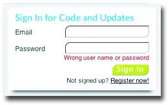
图7-12 登录表单及显示错误消息时的效果
无论多简单,表单所需的代码总是很多!好在,这里的代码大部分都很直观,配合注释看基本都能理解。我想提一下错误消息,它一开始是隐藏的,只有必要时才会显示(如图7-12所示)。要显示错误消息,只要给(已经有了direction类的)p元素再添加一个error类即可。不过,这个类是要通过验证表单的代码来添加的。作为负责网站UI的人,添加这种平时隐藏的HTML元素和显示它的CSS是你的事儿。至于什么时候添加error类显示错误消息,那就是开发团队的事儿了。
7.3.2 博文链接
表单下面是博文链接。与以往一样,我使用了无序列表来组织链接。
<nav><h3>Recent Articles</h3><ul><li><a href="#">Z-index—Layers of Confusion</a></li><li><a href="#">Box-Image Techniques</a></li><li><a href="#">Shadow FX with CSS3</a></li></ul></nav>
CSS如下。
section#feature_area nav {width:19em; /*容器整体宽度*/float:right;/*与区域右边对齐*/margin:15px 0 0; /*上方间距*/padding:.6em 0em .75em; /*链接上下的间距*/background:#fff;border-radius:10px 0 10px 0;box-shadow: 0 12px 8px -9px #555;}#feature_area nav h3 {padding:0 14px 0; /*标题左右的空间*/font-family:Lato, helvetica, sans-serif;font-weight:700;font-size:1.3em;text-align:left;color:#aaa;letter-spacing:-.05em;}#feature_area nav ul { margin:0em 0 0 20px; }#feature_area nav li {padding:.7em 0 0 2em;position:relative; /*项目符号的定位上下文*/list-style-type:none}#feature_area nav li:before { /*定制项目符号*/content:""; /*用空字符串,因为不需要实际内容*/position:absolute; /*相对于列表项定位*/height:10px; /*项目符号大小*/width:10px;left:12px; /*定位项目符号*/top:12px;border-radius:5px 0 5px 0; /*项目符号形状*/background-color:#d6e636; /*项目符号颜色*/box-shadow:1px 1px 2px #888;}#feature_area nav li a {display:block; /*链接与列表项同宽*/text-decoration:none; /*去掉默认的下划线*/font-size:.9em;color:#616161;}#feature_area nav li a:hover { color:#000; }
添加了样式之后的链接区就在登录表单正下方。它们都是aside元素的子元素,而aside元素通过浮动与article元素并列在一行。
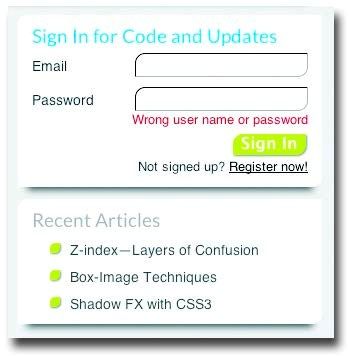
图7-13 完成博文链接,aside元素的样式就写好了
与浮动form元素一样,浮动nav元素可以让它直接定位在表单下方。列表的其他部分没有什么特别,但为了体现“两个圆角,两个方角”的设计风格,我们要重新定制项目符号。为此,我们抛弃用图片作为列表项记号的常规做法,使用::before创建了10像素见方的伪元素,并将其两角变成圆角。而一个像素的小阴影则让这些项目符号产生了跳脱页面的假象。
