 我的书签
我的书签
 添加书签
添加书签 移除书签
移除书签3.5.5 控件状态
每个控件(尤其是input)在使用的过程中,可能都会有很多种状态,比如输入内容的时候有焦点提示,输错的时候有出错提示等。Bootstrap提供了3种状态的样式可供使用,分别是:焦点状态、禁用状态、验证提示状态。
1.焦点状态
焦点状态的实现方式是在选择器: focus上删除默认的outline样式,重新应用一个新的box-shadow样式,从而实现焦点状态下,input出现柔和的阴影边框(注意,该效果必须使用.form-control样式才行)。运行效果如图3-24所示。
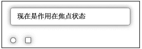 图3-24 焦点状态时的运行效果
该效果实现源码如下:
- // 源码1706行
- .form-control:focus {
- border-color: #66afe9;
- /* 作用域得到焦点时的边框颜色*/
- outline: 0;
- -webkit-box-shadow: inset 0 1px 1px rgba(0,0,0,.075), 0 0 8px rgba(102, 175, 233, .6);
- box-shadow: inset 0 1px 1px rgba(0,0,0,.075), 0 0 8px rgba(102, 175,
- 233, .6);
- }
从图3-24中可以看出,radio和checkbox的焦点效果和普通input的不太一样。Bootstrap对file、radio、checkbox的焦点效果做了一些特殊处理,以便更圆形化。源码如下:
- // 源码1675行
- input[type="file"]:focus,
- input[type="radio"]:focus,
- input[type="checkbox"]:focus {
- outline: thin dotted;
- outline: 5px auto -webkit-focus-ring-color;
- outline-offset: -2px;
- }
2.禁用状态
禁用状态的实现方式主要是完善默认disabled状态的显示状态,使用方式和普通的disabled一样,只需要在禁用元素上使用disabled属性即可。使用方法如下:
- <input type="text" placeholder="Disabled input here..." disabled>
其源码主要是设置了不准输入的鼠标样式和背景颜色(灰色)。注意,只有带.form-control样式的控件才会更改背景色。请看下面的源码:
- // 源码1725行
- .form-control[disabled],
- .form-control[readonly],
- fieldset[disabled] .form-control {
- /* 若form-control控件或fieldset元素被禁用,显示不允许输入手形图标*/
- cursor: not-allowed;
- background-color: #eee;
- opacity: 1;
- }
而如果不使用上述样式,直接在普通的元素上使用disabled属性,则只会显示一个不能输入的手形图标。源码如下:
- // 源码1780行
- input[type="radio"][disabled],
- input[type="checkbox"][disabled],
- .radio[disabled],
- .radio-inline[disabled],
- .checkbox[disabled],
- .checkbox-inline[disabled],
- fieldset[disabled] input[type="radio"],
- fieldset[disabled] input[type="checkbox"],
- fieldset[disabled] .radio,
- fieldset[disabled] .radio-inline,
- fieldset[disabled] .checkbox,
- fieldset[disabled] .checkbox-inline {
- cursor: not-allowed;
- }
从上述源码可以看出,fieldset如果使用了disabled属性,则fieldset内部的input、select、textarea或应用了.form-control样式的其他控件也将为禁用状态。让我们来验证一下,示例如下:
- <fieldset disabled>
- <legend><input></legend>
- <input type="text" placeholder="Disabled input">
- <select>
- <option>不可选择</option>
- </select>
- <div class="checkbox">
- <label><input type="checkbox">记住密码</label>
- </div>
- <button type="submit" class="btn btn-primary">提交</button>
- </fieldset>
运行效果如图3-25所示。我们发现大部分都被禁用了,但是legend内的input却没有被禁用,依然可以输入文本,这是因为这是HTML5的一个限制,即fieldset内的第一个legend元素不受disabled的影响。Bootstrap为了遵守这一规则(其实实现起来也很复杂,要用JavaScript代码进行实现)就继续保持原状了,大家使用过程中要特别注意。
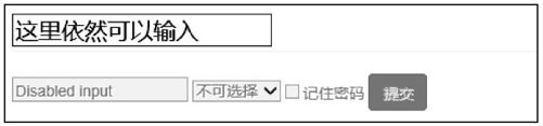 图3-25 禁用状态时的运行效果
注意
由于IE不支持fieldset下的disabled属性(比如,IE10不支持input和button),所以IE下的开发者需要用JavaScript代码再进行特殊处理。
fieldset上应用disabled时,fieldset内部的a标签在所有浏览器下的单击行为都不能被禁用(比如:<a class="btn btn-default">),需要使用JavaScript代码再进行特殊处理。
3.验证提示状态
在填写表单的时候,经常要提示用户其输入内容是否合法,长度是否够用,再次输入的密码是否和第一次输入的密码一致,或者输入的用户名存在还是不存在等问题,不同的提示可能需要不同的提示状态(如,颜色、边框、提示语等)。Bootstrap提供了.has-warning、.has-error、.has-success三种样式用于分别表示警告(黄色)、错误(红色)、成功(绿色)语境的内容。代码如下:
- <div class="form-group has-warning">
- <label class="control-label" for="inputWarning">输入长度不够!</label>
- <input type="text" class="form-control" id="Text1">
- </div>
- <div class="form-group has-error">
- <label class="control-label" for="inputError">输入不符合要求!</label>
- <input type="text" class="form-control" id="Text2">
- </div>
- <div class="form-group has-success">
- <label class="control-label" for="inputSuccess">输入文本符合要求!</label>
- <input type="text" class="form-control" id="Text3">
- </div>
从示例代码可以看到,使用了form-group、control-label、form-control标签进行分组(关于控件分组,会在后续章节进行解释),在form-group平级的div元素上应用has-*样式,然后在input元素上应用form-control样式,实现效果如图3-26所示。
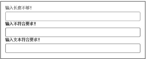 图3-26 验证提示的运行效果
has-error和has-success的实现方式相同,只是对文字、边框和阴影设置的颜色不同。has-warning的实现源码如下:
- // 源码1866行
- .has-warning .help-block,
- .has-warning .control-label,
- .has-warning .radio,
- .has-warning .checkbox,
- .has-warning .radio-inline,
- .has-warning .checkbox-inline { /* has-warning容器内部的控件文本颜色统一设置*/
- color: #8a6d3b; /* 不使用control-label,使用其他的(如help-block)也可以*/
- }
- .has-warning .form-control {
- /* 为has-warning容器内部的form-control控件设置边框和阴影效果*/
- border-color: #8a6d3b;
- -webkit-box-shadow: inset 0 1px 1px rgba(0, 0, 0, .075);
- box-shadow: inset 0 1px 1px rgba(0, 0, 0, .075);
- }
- .has-warning .form-control:focus {
- /* has-warning容器内部的控件在得到焦点时的效果颜色更深*/
- border-color: #66512c;
- -webkit-box-shadow: inset 0 1px 1px rgba(0, 0, 0, .075), 0 0 6px #c0a16b;
- box-shadow: inset 0 1px 1px rgba(0, 0, 0, .075), 0 0 6px #c0a16b;
- }
- .has-warning .input-group-addon {/* addon的背景色和字体颜色也要同步设置*/
- color: #8a6d3b;
- background-color: #fcf8e3;
- border-color: #8a6d3b;
- }
注意
上述.input-group-addon样式的效果会在4.5节进行讲述。
有的时候,我们在验证状态时提供所对应状态的小图标,以便能够直观地显示,实现效果如图3-27所示。
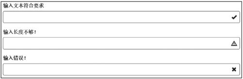 图3-27 小图标提示的运行效果
从运行效果可以看到,小图标肯定是固定在输入框的右边的。要实现这种效果,通常要解决两个问题:首先设置输入框父元素的定位方式为相对定位,然后设置这种小图标的定位方式为绝对定位(并设置right值)。
Bootstrap针对该功能提供了特殊的feedback样式,用于实现该效果。其用法如下:
- <div class="form-group has-success has-feedback">
- <label class="control-label" for="inputSuccess2">Input with success</label>
- <input type="text" class="form-control" id="inputSuccess2" />
- <span class="glyphicon glyphicon-ok form-control-feedback"></span>
- </div>
该效果运用了两个样式:父容器上的has-feedback样式用于设置定位方式;小图标元素上的form-control-feedback样式用于设置图标的显示大小等。两个样式的源码正好符合我们前面所说的要求,具体源码如下:
- // 源码1824行
- .has-feedback { position: relative; /* 相对定位,用于设置input元素的父容器的定位方式*/}
- .has-feedback .form-control { padding-right: 42.5px;
- /* 右内边距的设置,以便可以显示小图标*/ }
- .has-feedback .form-control-feedback { /* 设置小图标的显示方式*/
- position: absolute;/* 绝对定位*/
- top: 25px;
- right: 0; /* 右对齐*/
- display: block;
- width: 34px;
- height: 34px;
- line-height: 34px;
- text-align: center;
- }
- .has-success .form-control-feedback { color: #3c763d; /* 验证通过时图标的显示颜色 */}
- .has-warning .form-control-feedback { color: #8a6d3b; /* 验证警告时图标的显示颜色 */}
- .has-error .form-control-feedback { color: #a94442; /* 验证错误时图标的显示颜色 */}
上述源码的最后3行分别设置了不同验证状态下的小图标的颜色。
