 我的书签
我的书签
 添加书签
添加书签 移除书签
移除书签3.5.6 控件大小
Bootstrap提供了两个样式用于设置稍大或者稍小的input输入框,分别是:.input-lg和.input-sm。使用方式如下:
- <input class="input-lg form-control" type="text" placeholder="较大">
- <input class="form-control" type="text" placeholder="正常大小">
- <input class="input-sm form-control" type="text" placeholder="较小">
运行上述样式后的效果如图3-28所示。
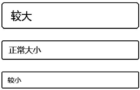 图3-28 3种大小输入框的运行效果
控件大小的实现思路是给input输入框设定不同大小的padding、font-size、border-radius值。从如下源码也可以看出,.input-lg和.input-sm样式不仅适用于input,也适用于select和textarea元素。
- /* 源码1794 行*/
- .input-sm { /* 设置小的输入框input*/
- height: 30px;
- padding: 5px 10px;
- font-size: 12px;
- line-height: 1.5;
- border-radius: 3px;
- }
- select.input-sm { /* 设置小的选择框select*/
- height: 30px;
- line-height: 30px;
- }
- textarea.input-sm,
- select[multiple].input-sm { /* 设置小的文本框textarea*/
- height: auto;
- }
- .input-lg { /* 设置大的输入框input*/
- height: 46px; padding: 10px 16px; font-size: 18px; line-height: 1.33;
- border-radius: 6px;
- }
- select.input-lg { height: 46px; line-height: 46px; /* 设置大的选择框select*/}
- textarea.input-lg,select[multiple].input-lg { height: auto; /* 设置大的文本框
- textarea*/}
注意
根据上述源码,也可以按照类似规则,为上述3种元素定义其他大小的样式,比如,.input-mini。
再仔细看一下上述代码,发现上述代码在设置大小的时候只设置了高度,并没有设置宽度。所以,在实际设计过程中,对于不同尺寸的元素还要进行相应宽度的调整。好在这些元素默认都是100%显示,而且还有栅格系统提供的支持。所以对于控制宽度,可以按照如下方式设置:
- <div class="row">
- <div class="col-xs-2">
- <input type="text" class="form-control" placeholder=".col-xs-2">
- </div>
- <div class="col-xs-3">
- <input type="text" class="form-control" placeholder=".col-xs-3">
- </div>
- <div class="col-xs-4">
- <input type="text" class="form-control" placeholder=".col-xs-4">
- </div>
- </div>
