 我的书签
我的书签
 添加书签
添加书签 移除书签
移除书签9.3 Buttons
Buttons是一个基于Sass和Compass构建的CSS按钮(button)样式库(官方网站是http://alexwolfe.github.io/Buttons/),其对按钮的支持度远远高于Bootstrap默认的按钮。笔者在写作的过程中本想以btn样式为例进行扩展写一篇实战,但是后来发现这个Buttons以后,就放弃了,因为它真的很强大,拥有各种各样的按钮、各种各样的样式、各种各样的效果。
首先在官方网站下载该插件,然后引入。由于Buttons插件使用了Font Awesome,所以引入的示例如下:
- <link rel="stylesheet" href="css/font-awesome.css">
- <link rel="stylesheet" href="css/buttons.css">
- <script type="text/javascript" src="js/jquery-1.10.1.min.js"></script>
- <script type="text/javascript" src="js/buttons.js"></script>
注意,只有在需要使用小图标的时候才引入font-awersome.css文件。两个JS文件也是可选的,只有在使用该插件里的下拉菜单功能时,才需要引入这两个JS文件。
对于该插件的功能,我们只打算列一下功能列表和使用方法,不分析其源码(因为这可以单独写一本书了)。常见的运行效果如图9-8所示。
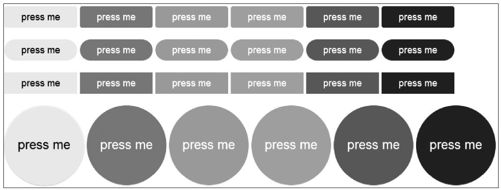 图9-8 扁平化按钮
上述效果的基本用法如下:
- <a href="#" class="button button-flat">press me</a>
- <a href="#" class="button button-flat-primary">press me</a>
- <a href="#" class="button button-flat-action">press me</a>
- <a href="#" class="button button-flat-highlight">press me</a>
- <a href="#" class="button button-flat-caution">press me</a>
- <a href="#" class="button button-flat-royal">press me</a>
上述示例是默认效果,也就是图9-8中的第三种效果。从示例中也可以看出,颜色风格和Bootstrap并不一致,而是使用了primary、action、highlight、caution以及royal名称。
而对于第1、2、4种效果,则只需要分别再多应用一个风格样式即可,它们是:button-rounded、button-pill以及button-circle。部分示例如下:
- <a href="#" class="button button-rounded button-flat">press me</a>
- <a href="#" class="button button-rounded button-flat-primary">press me</a>
- <a href="#" class="button button-pill button-flat-action">press me</a>
- <a href="#" class="button button-pill button-flat-highlight">press me</a>
- <a href="#" class="button button-circle button-flat-caution">press me</a>
- <a href="#" class="button button-circle button-flat-royal">press me</a>
而如果需要发光效果的按钮,则需要添加一个glow样式。示例代码如下:
- <a href="#" class="button glow ">press me</a>
- <a href="#" class="button glow button-primary">press me</a>
- <a href="#" class="button glow button-action">press me</a>
- <a href="#" class="button glow button-highlight">press me</a>
- <a href="#" class="button glow button-caution">press me</a>
- <a href="#" class="button glow button-royal">press me</a>
上述示例的运行效果如图9-9所示。
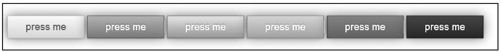 图9-9 发光效果的按钮
如果在第一个例子中,取消button-flat开头的样式,保留button-rounded样式,则会是默认的立体按钮。示例如下:
- <a href="#" class="button button-rounded">press me</a>
- <a href="#" class="button button-rounded button-primary">press me</a>
- <a href="#" class="button button-rounded button-action">press me</a>
- <a href="#" class="button button-rounded button-highlight">press me</a>
- <a href="#" class="button button-rounded button-caution">press me</a>
- <a href="#" class="button button-rounded button-royal">press me</a>
上述示例的运行效果如图9-10所示。
 图9-10 立体效果按钮
如果需要3D按钮,则如下定义样式就可以了:
- <a href="#" class="button button-3d">press me</a>
- <a href="#" class="button button-3d-primary button-rounded">press me</a>
- <a href="#" class="button button-3d-action button-pill">press me</a>
- <a href="#" class="button button-3d-highlight button-circle">press me</a>
- <a href="#" class="button button-3d-caution"><i class="fa fa-camera">
- </i> press me</a>
- <a href="#" class="button button-3d-royal button-rounded">press me</a>
上述示例的运行效果如图9-11所示。
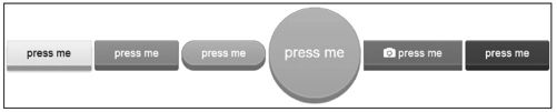 图9-11 3D效果按钮
如果想保留边框效果,那可以如下定义:
- <a href="#" class="button button-border">press me</a>
- <a href="#" class="button button-border-primary button-rounded">press me</a>
- <a href="#" class="button button-border-action button-pill">press me</a>
- <a href="#" class="button button-border-highlight button-circle">press me</a>
- <a href="#" class="button button-border-caution"><i class="fa fa-camera"></i> press me</a>
- <a href="#" class="button button-border-royal button-pill">press me</a>
上述示例的运行效果如图9-12所示。
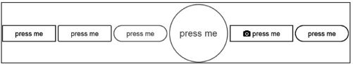 图9-12 带边框效果的按钮
如果要定义按钮的大小,则可以像如下示例这样使用:
- <a href="#" class="button button-rounded button-flat-primary
- button-large">press me</a>
- <a href="#" class="button button-rounded button-flat-primary">press me</a>
- <a href="#" class="button button-rounded button-flat-primary
- button-small">press me</a>
- <a href="#" class="button button-rounded button-flat-primary button-tiny">
- press me</a>
上述示例的运行效果如图9-13所示。
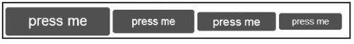 图9-13 不同尺寸的按钮
而且还可以在按钮上添加小图标。示例如下:
- <a href="#" class="button button-rounded button-flat"><i class=
- "fa fa-github"></i> press me</a>
- <a href="#" class="button button-rounded button-flat-primary"><i class=
- "fa fa-refresh"></i> press me</a>
- <a href="#" class="button button-rounded button-flat-action"><i class=
- ""fa fa-cloud"></i> press me</a>
- <a href="#" class="button button-rounded button-flat-highlight"><i class=
- "fa fa-camera"></i> press me</a>
- <a href="#" class="button button-rounded button-flat-caution"><i class=
- "fa fa-code"></i> press me</a>
- <a href="#" class="button button-rounded button-flat-royal"><i class=
- "fa fa-envelope"></i> press me</a>
上述示例的运行效果如图9-14所示。
 图9-14 按钮图标
上面这些功能是Buttons插件中的很少一部分,详细的功能列表,请访问官方网站进行查询。我个人觉得,一般系统的按钮用这一套插件就足够了。
